Why you should send beautifully design marketing emails
An analysis of a leading retailers email marketing welcome campaign
Have you ever looked at the marketing emails in your inbox from a business perspective? By that I mean analysing its content, layout, design, and what it is trying to get you to do and how successful it is in getting you to do so?
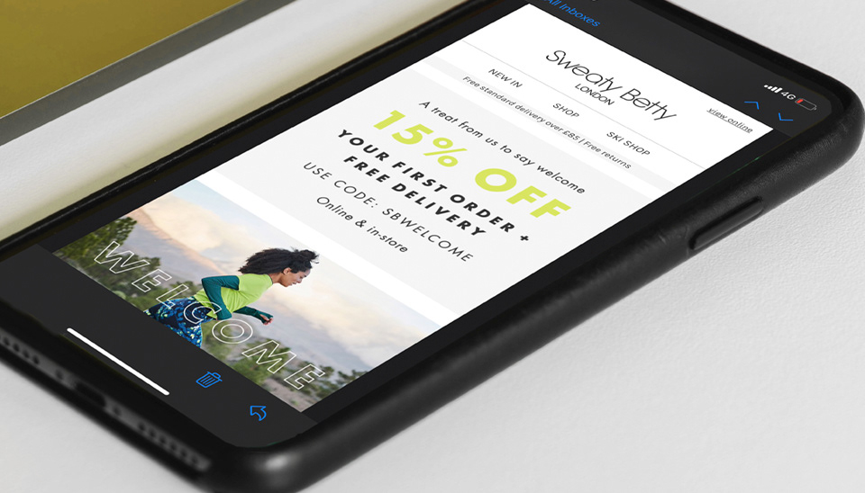
Take this email from sweaty Betty for example; if we take a look at their welcome email they send out when you sign up to their mailing list, we can analyse and and apply the following to our own emails:
subject field and preview text
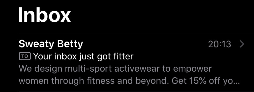
They are direct, confident and make you curious about what is in the email. MailChimp advises no more than nine worded subject fields generally perform better. When writing your subject field, think about what might make your audience open the email and what you want them to do when they view it's contents.
In my marketing emails, I want to share my knowledge and provide some value added content to illustrate my competence in my craft. This helps me to build trust with my audience and hopefully turns some of my audience into clients that genuinely want to create something amazing with me. Therefore; I generally go with a question as my subject field and then follow this with a version of my blog title that gives a hint of what the email is about.
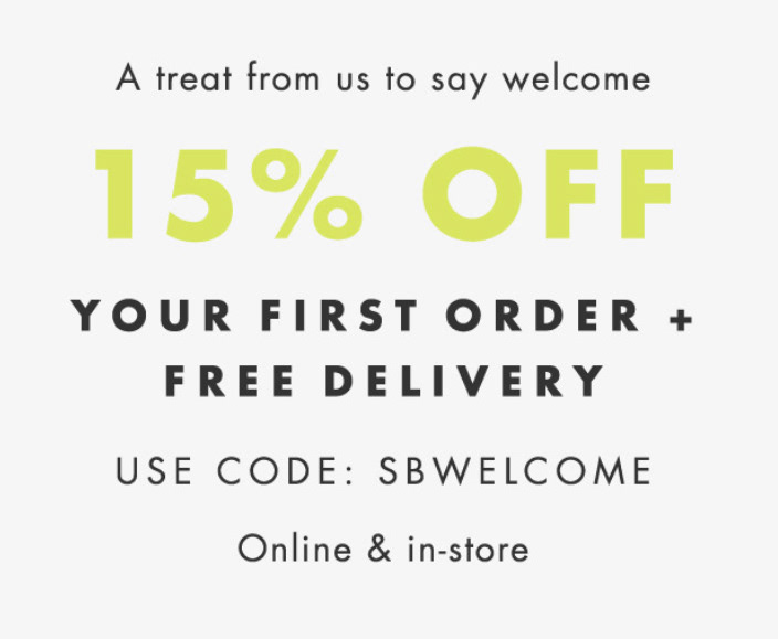
With sweaty betty's preview text, they firstly introduced themselves and what they do and finish it with “get 15% off”... As there is only room for so much text, it leaves you wondering: “15% off what?” And thus, makes you open their email.
Header logo and links
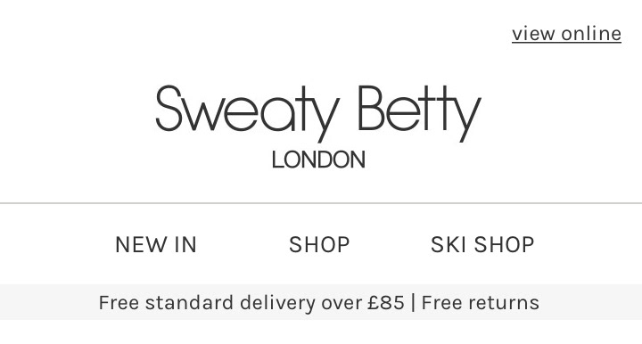
Think about your header of every email being an extension of your website. If your logo is centered on your website, do the same on your emails to keep your branding consistent. Consider its proportions and size , stay within your brand guidelines and parameters.
Here we see sweaty betty's logo mirroring their website, along with the navigation bar to shop on their website. They even mirror their current marketing banner, in this case their free delivery message. This instantly gives the feeling like you are almost looking directly at their website.
Main banners and call to action buttons
They then hit you with a clear, text only marketing message, with the 15% off offer and a code to use on your first purchase on their website. This makes you want to then Scroll down to see what's on offer and whether you may want to take advantage of the discount.
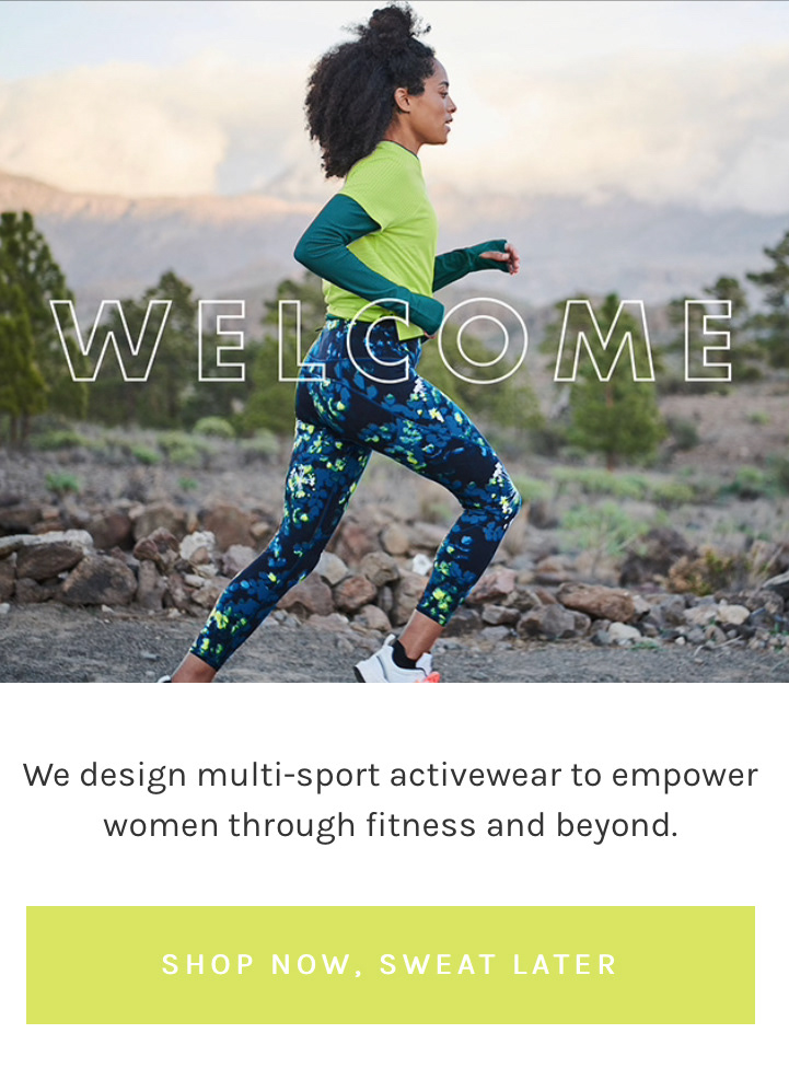
The banner following this is a beautiful location shot showcasing one of their products on offer. This image also illustrates what products they provide and that they are in the business of fitness fashion. They follow with a shop now button to get you to click through to their website. You will notice they apply these call to action buttons in every section of the email. You may feel like you are repeating yourself when you do this in your own emails, but you will be surprised how often your audience needs to be directed on what to do with the information in front of them.
Secondary banners and links
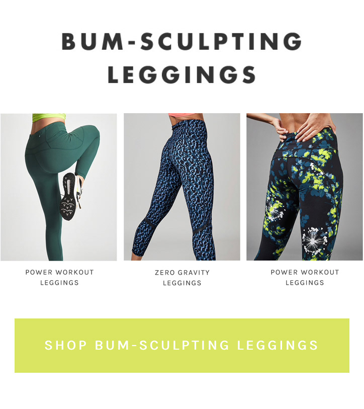
Sweaty Betty feature their latest range of products here, linking to that section on their website. Think again about this being an extension of your website and how many clicks have to be made before your customer can make a purchase. The more clicks, the more likely your audience will move away from your website. However, you need to balance that with giving them a link to a web page or product page that gives them some choice or content, depending on your target market.
For me, my ultimate goal isn't product purchases, but having conversations with potential clients. Therefore, I need my audience to contact me using any of the methods on my website. To help with this, I add a contact form on every page of my website so they don't need to click away to another page or two and then drop off my website altogether. On my marketing emails, I also have a banner that links directly to my contact page to again, minimise my audience having to click a number of different pages first.
Create trust and social media
If you use reviews on your main touch points, such as your website and social media accounts, make sure you extend that to your emails. Sweaty Betty continue with their consistent email branding and include a text based banner with a recent review from a magazine. Don't be afraid to shout about your successes.
I use trust pilot as it is a professional and well known site for reviews and I again need to build trust with my audience to enable me to convert my readers into clients. Trust pilot only allows genuine reviews and their algorithm blocks bots and bogus reviews so my readers can be safe knowing that my ratings are real and true. Consider your products and/or services , as well as your audience and use a tone of voice that speaks to them in the right way.

The magazine review for sweaty Betty makes a statement about Jennifer Aniston wearing their products, getting you to consider the notion that if a world known famous actress wears their products, then they must be high quality and worth the monetary value.
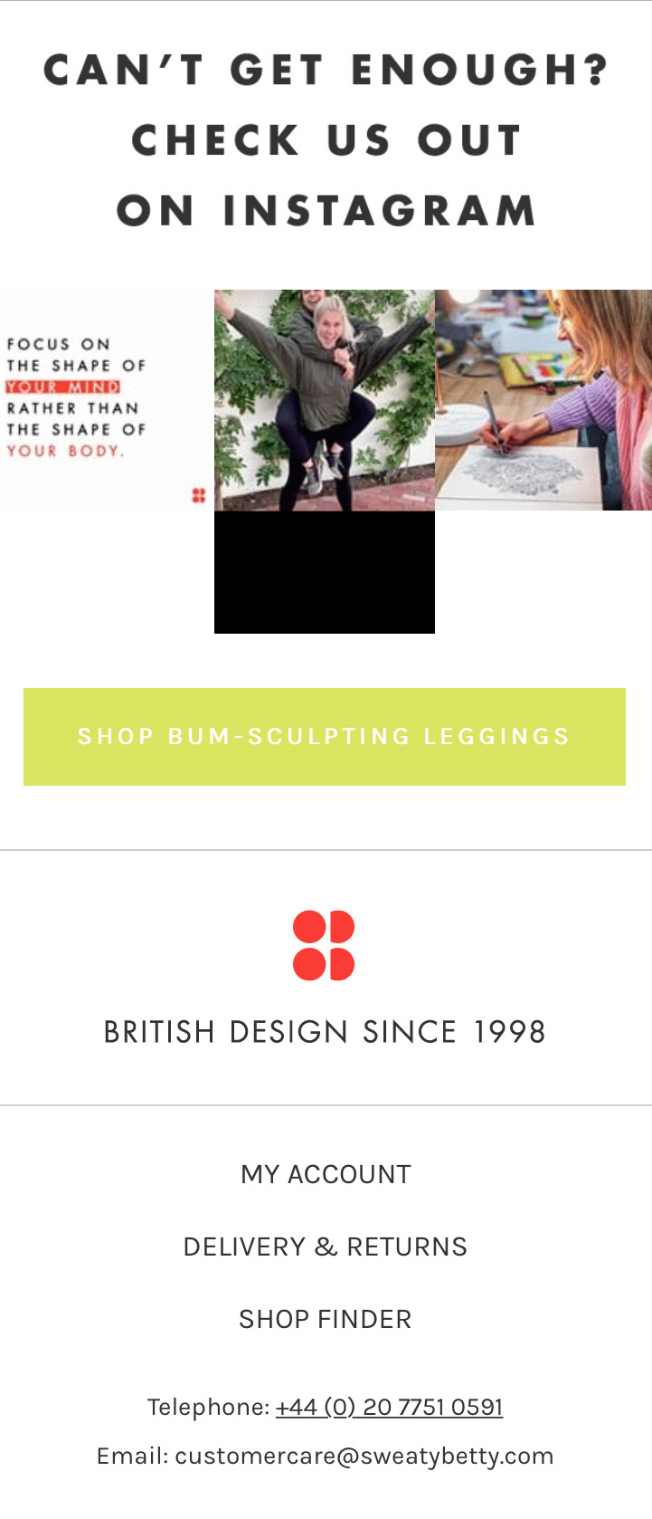
Below this, Sweaty Betty cement the quality of their products, by using what looks like a live feed to their Instagram account. This features current influencers and famous individuals using and wearing their products . This is likely to be a GIF designed to look like an Instagram widget that then links directly to their Instagram account.
Footer and additional functions
Use your footer to further direct your audience to your website. Here, sweaty Betty use more personal links such as “my account” and “delivery and returns.” They also detail their contact information here.
Other points to consider when designing your email campaigns include; keeping them at a good length, you don't want them too long but also ensure they have enough context. Don't send too many emails, most email providers will categorise emails they consider spam, directly into the receivers junk mailbox and it is then likely your email will not be read by your audience. Do your research on email marketing and optimum times to send emails based on your target audience. The last thing you would want to do is send out your weekly emails over the course of a few months to then find you have been sending them on the wrong day or at the wrong time and missing valuable sales and contact opportunities with your audience.
Subscribe
LETS CONNECT!
Sign up to my newsletter to ensure you receive Freebies, updates on my latest informational blogs and offers.
Thank you!
Hi!
GET IN TOUCH
If you would prefer someone to design your emails for you, to ensure that you are hitting your target market with the right imagery and calls to actions, please feel free to contact me to discuss how we can work together to improve your email marketing successes.
Hi and thank you for getting in contact. I will reply shortly. Wishing you a great day! Please feel free to take a look at my Social media in the mean time! https://www.instagram.com/lindseylahmet_official/
Say hello
ON INSTAGRAM!
Thats where I like to show my personal creative side and my recent work!