Expressive Design
WINNER OF THE 2017 TYPO DAY COMPETITION
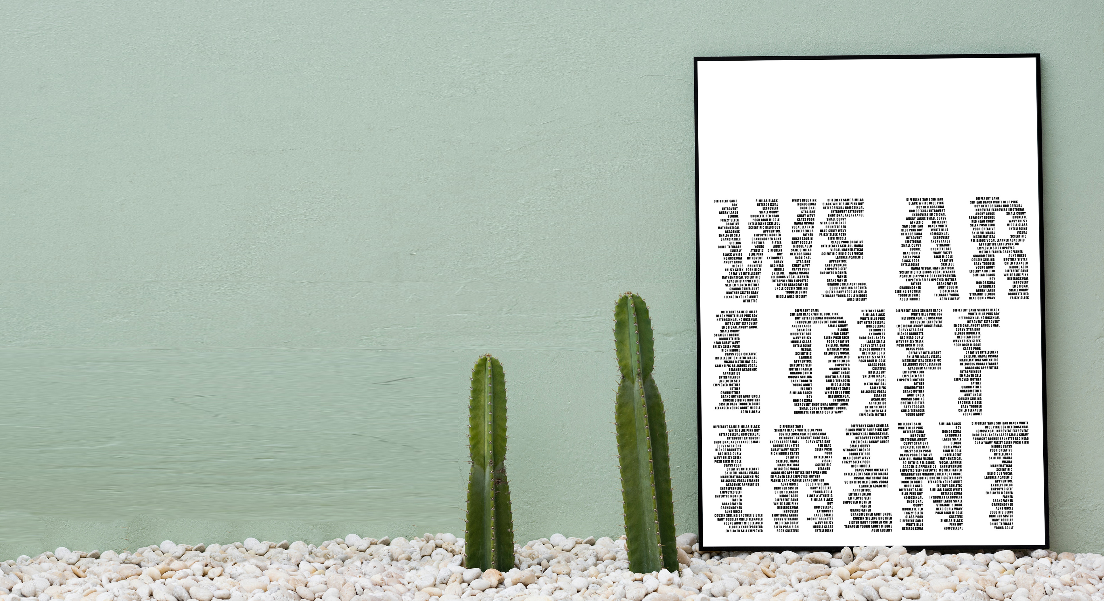
THE BRIEF
To design a piece of artwork that represented diversity through typography for the Sri Lanka 2017 Typo Day competition at the Columbia University.
INSPIRATION
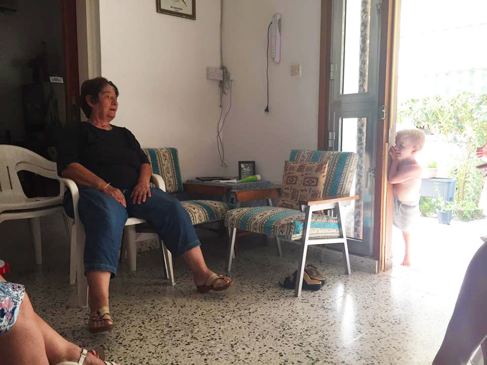
The thought process for this piece came from an interaction between my son and my great Auntie whilst on holiday in Northern Cyprus. My Auntie doesn’t speak very much English and my son doesn’t speak any Turkish. They spent their time together playing a game only known to themselves.
I was intrigued with how they were ‘talking’ to one another with so many differences and barriers. These barriers included language, age and even gender.
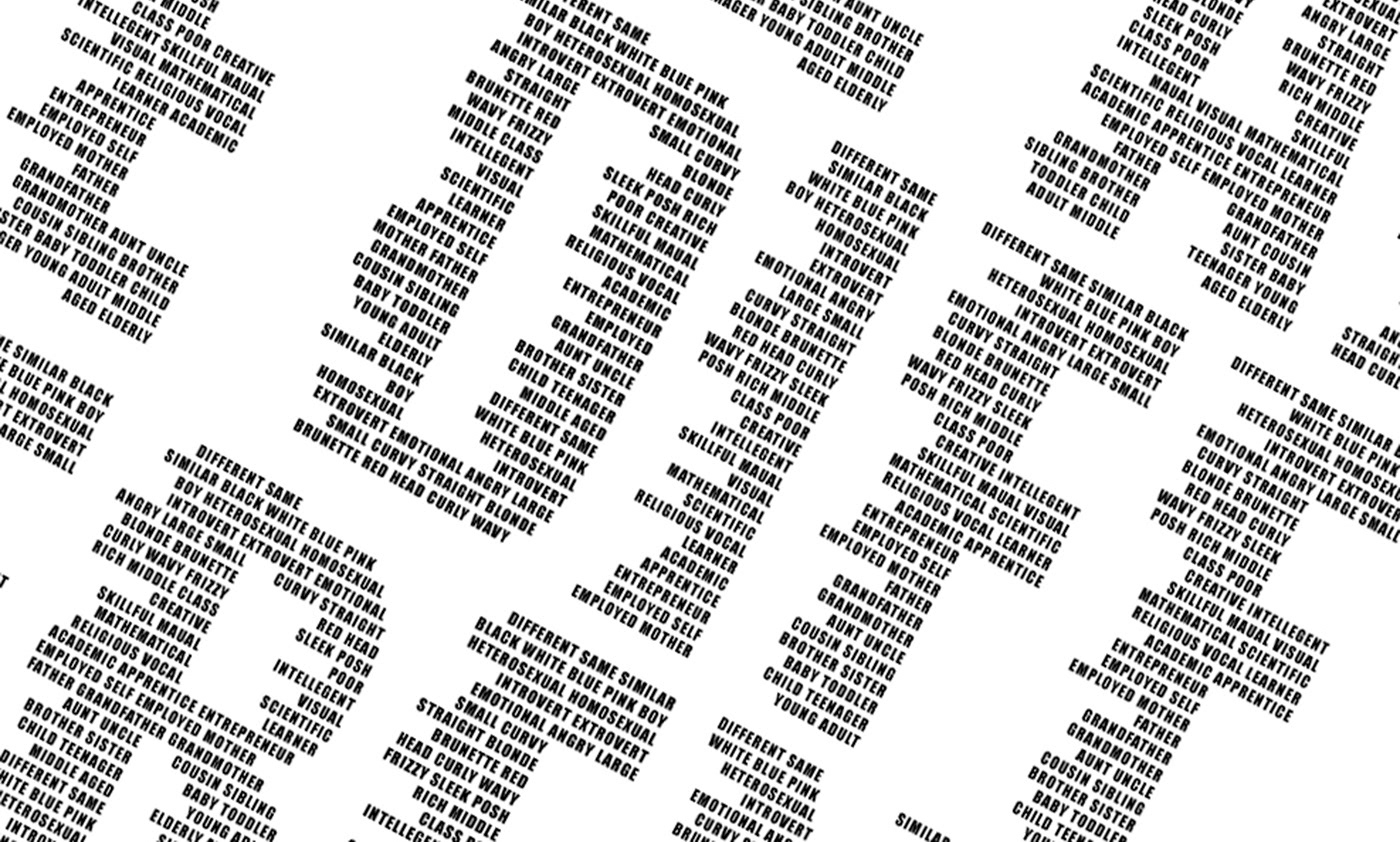
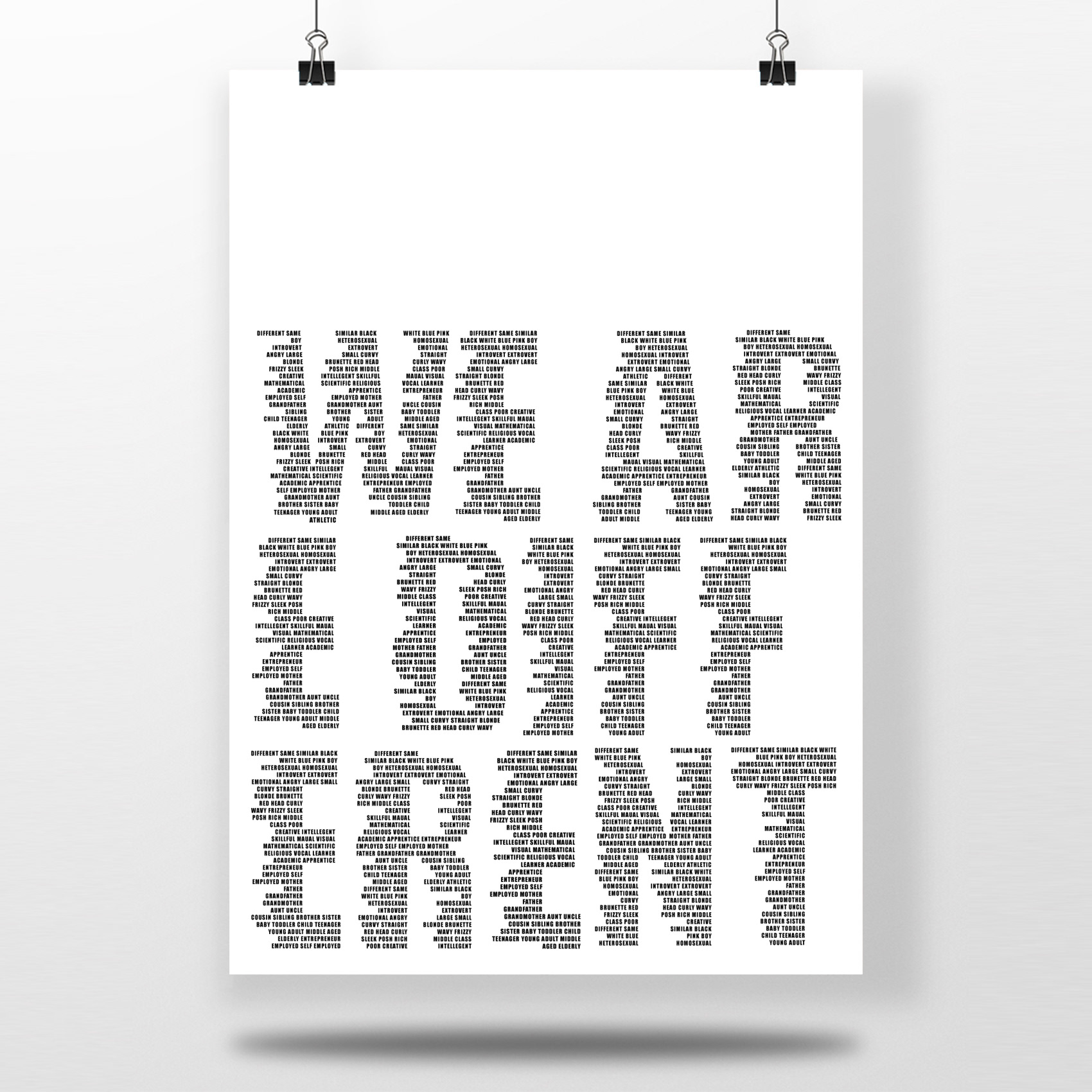
I started to think about what diversity meant to me and its simplest meaning. I came to my own opinion that diversity is to simply be different.
Every human on this planet is diverse. There are no two humans that are exactly the same so by definition we are all different. I wanted my work to look at the stigma around diversity and the “norm”.
THE FONT
The typeface was chosen based on the need for space between each letter form and for clarity of the words within each letter.
THE COLOUR
The colour was selected to ensure that the concept was not diluted and its audience was not unfocused by colour. From a dyslexic point of view, it is also most legible when text is black on white paper and including disability as another element that can make a person be considered as different.
THE DESIGN
The design concept is focused around ‘breaking the rules’ of design with right aligned text, words divided across lines and not beginning at the top left of the page. Using the idea that breaking the rules is a form of being different, as diverse is currently perceived as being different to the “norm”.
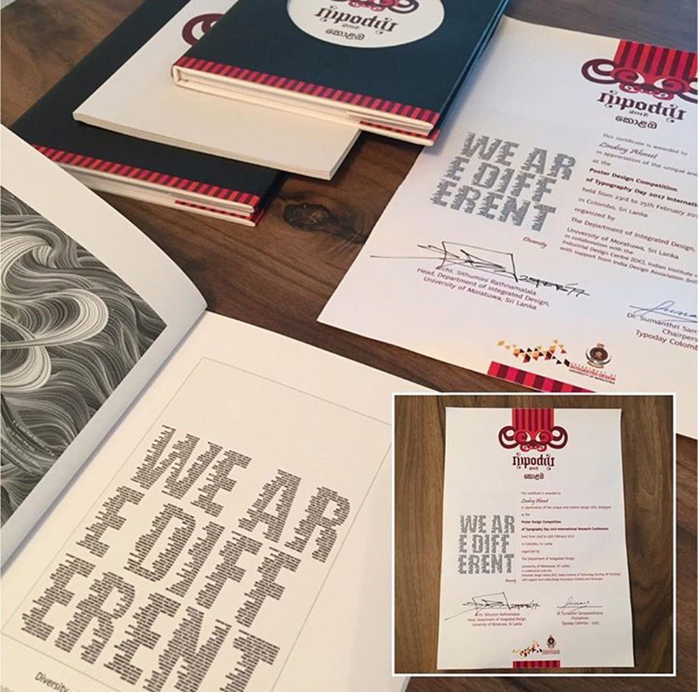
UK 2017 WINNER
Below is an image of the package I got from Sri Lanka, when I found out I was one of 25 global winners.
Subscribe
LETS CONNECT!
Sign up to my newsletter to ensure you receive Freebies, updates on my latest informational blogs and offers.
Thank you!
Hi!
GET IN TOUCH
Please feel free to contact me about your project, using the form or via any one of the social media links in the top right and bottom of this page.
Thank you for your message, I will be in contact shortly.
Say hello
ON INSTAGRAM!
Thats where I like to show my personal creative side and my recent work!